
SPRAWL MAGAZINE
Publication Design Fall 2023
THE BRIEF
For my largest-format project to date, I was tasked with creating a fictional magazine from scratch. I surveyed the world of editorial design and applied the principles of graphic design through the branding and creation of one 24-page magazine. I explored complex typographic systems for the page, including grid structures, comprehensive style sheets, and complex compositional structures. Through research and design exercises, I developed a strong understanding of the marketplace. In addition, I demonstrated the power of storytelling by creating original imagery tied to editorial content. The project spanned half the semester, broken down into several parts to make the process easier.
For context, our main project requirements were:
» 24 pages minimum
» Front Cover (including: logo, headline, cover lines, page furniture)
» Magazine or Bookazine Logo/Nameplate
» Spine
» Back Cover
» Table of Contents (two-pages, either two singles or a spread)
» Masthead/Contributors Section
» Front Briefs Section (examples include: letter from the editor, letters to
editor, product roundups, columnists, reviews)
» 1 Article Feature-Mostly Text-Based (five pages or more that must
open with a spread)
» 1 Visual Driven Feature (five pages or more that must open with a spread)
» 2 Informational Components (infographics)
» Back Briefs Section (examples include: shorter articles, listings
[music, movies, concerts, etc.], new content section, remaining
columns, horoscopes)
I decided I was going to leave my comfort zone in a pretty major way while designing Sprawl. I wanted Sprawl to be simplistic, elegant and modern, utilizing lots of negative space, structured type design, and beauty in simplicity. Anyone who has ever looked at my portfolio will know that’s not my usual approach, so I set out on this project to explore my range and produce something that I’d still like and find beautiful and be proud of, but looks like someone else entirely could have designed it.
THE MARKET
Sprawl Magazine is a travel and lifestyle magazine focusing on the visual beauty of Earth's architectural wonders and their intersectionality with the beauty of nature.
The main publications I looked at during ideation were AFAR, Travel and Leisure, Conde Nast’s Traveler, and Architectural Digest. It was interesting examining these magazines with a close lens and trying to find an unfilled niche that Sprawl could fit into. I decided that despite wanting to step far out of my comfort zone, illustration was still a must-have, since I still wanted this to be a good display of my editorial illustration capabilities. All of the magazines I looked at may occasionally feature illustration, but aren’t features of any house style. This became one facet of the identity I could fit myself into. I also realized that most travel magazines were pretty utilitarian – here’s a destination, here’s where to stay, here’s what to bring – and I think that’s important, but I wanted to take a bit more of an aspirational approach to Sprawl, mixing the appreciation of beauty with something that could be genuinely useful.

At long last, I had found my desired niche.

THE CONCEPT
So. Here's what I was thinking.
• Art through structural elegance and natural beauty
• Travel through adventure and experience, not the typical beach vacation
• More everyday than Conde Nast, but elevated from the grocery store aisle
• Upper-middle class, unisex target audience
• Enjoyable whether it’s inspiration or attainable
Below are some moodboards I developed for my initial magazine conceptual pitch. Most of these remained a primary source of visual inspiration food as I continued developing the visual identity of Sprawl.

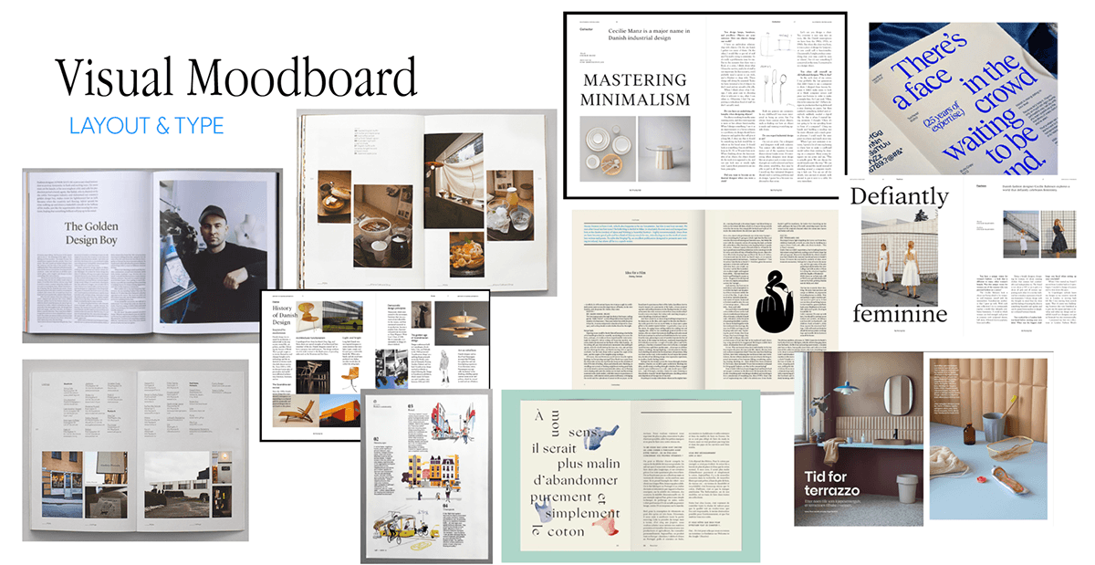

Here's also when I started collecting content. No, I didn't use all of these articles. Yes, I had no idea how much content was really going to possible in this timeframe.
In case it wasn't obvious, this issue of Sprawl is going to be highlighting Greece.

TYPE EXPERIMENTS
Next step, as we all know, is getting started on developing the perfect typography system. My professor had warned me from the beginning that if I wanted to achieve the clean text columns and text wraps that I had shown in my visual inspiration moodboards, I needed to get cracking on type selection right away to have enough time to properly experiment.
Trust me, this process is more grueling than these pages make it look. Between every one of these pages was me printing, scrutinizing under close eye, and then adjusting with my next set.


Finally, I had hit my own personal gold. A type system that both I (and my professor with skyscraper-high standards) liked. Once satisfied, I used my selections to develop my grid, which is pretty simple if you do your type experiments correctly! I ended up using a 9x9 modular grid with 0.625 inch margins. Here's a tentative style guide that I developed afterwards - with and without my grid.

After that, I took some time to develop a quick skeleton spread that showcased my type in use as well as a potential use of image. You'll see later that this skeleton spread, though considerably changed, survived until my final iteration!

MASTHEAD DEVELOPMENT
Alright, now for an exciting part- developing my magazine's masthead! Anyone from a casual magazine skimmer to a publications design professional knows that a magazine's masthead is the most concrete part of its brand identity, the one thing that doesn't change much from cover to cover.


Mastheads are beautiful in their simplicity- I didn't need to re-invent the wheel, I just needed something that would be visually memorable and of a similar tone to the magazine as a whole.
As you can see, I only really loved one of my sketches. After running it by the members of my first professional panel of this project, I decided with the help of Hannah Ryan that I wanted a dynamic logo that changes with every issue, depending on where in the world that issue is focusing on. Because of this, I wanted to make sure to keep the masthead elegant and simple, so that the small change on the crossbar shape of the A would be easy to spot. A purposefully un-subtle Easter egg for my hypothetical readers, let's say.
FINAL STYLE GUIDE
Sweet! Starting to feel real now.
A couple of notes that aren't immediately obvious by looking at my style guide:
1. The 'wave crossbar' logo that is most prominently featured isn't the main logo, just the one I would be using for this hypothetical issue of Sprawl.
2. Similarly, in future issues of Sprawl, the blue tones would remain as a permanent part of the house style, but the contrast 'pop' color (in this case, orange) would change per destination.

As I’ve said a couple times already, I knew I was going to be limiting myself during the design process to keep myself from over-designing. I had some pretty strict rules for myself. I implemented a strict 5-color palette (and really it was two, they were all shades of blue and orange) and told myself I was only allowed to include one illustration per page, and it had to be smaller than any other major element on the page (this is discluding my full-bleed illustrations). My type rules were established very early and they only wavered when designing for the features. There was usually always a ‘free column’ in my page layouts to force myself to leave breathing room. Every time I considered adding something new to a spread design, I had to ask myself multiple times ‘Am I adding this because it will strengthen the layout or because I’m uncomfortable with white space?’. That led to multiple assets being left off the page once I began my design process.
COVER & TABLE OF CONTENTS
The long road continues.
I wanted to make sure to have a really beautiful shot on the front cover. What else but eye candy to catch the wandering eye's attention? It's important to note that my cover had to highlight one of the feature stories. The door draft very quickly becomes irrelevant as I decided to lose that story and re-approach one of my features.


In terms of the table of contents, I explored a few different options, but everyone unanimously decided the full-bleed Mediterranean cliffside shot was the winner. Can't say I blame them- any Grecian cliff shot is worth using.
I secretly liked the half-and-half composition more, but worried about running out of space. Perhaps in my fictional next issue.


BRIEFS
Alright, I know I'm trying to set the record for the world's longest portfolio entry, so I'll speed it up. From here, the design speed really picked up. I designed my front briefs and features to accompany the bits I'd already done, then installed the back briefs and went in for my second panel critique. I got a lot of great feedback with so many sets of eyes on Sprawl as I had eyes on the finish line. Below are a few progress pics of my briefs.


As you can see here, I decided to finally bring back the tile patterning dream from way earlier in the project.This gorgeous trim went on the front and back briefs spreads, and helps the reader easily distinguish briefs from features while reading. Also- look! I told you this spread would come back!

Now is time for the real fun part. To refresh from my way-back-aforementioned project requirements, we were tasked to design two features- one text-dominant and one visual.
I had found the perfect article for my text feature way back during my content collection phase. The article, written by journalist and occasional novel author Andrew Sean Greer, is a beautiful love letter to the somewhat underrated Greek island of Paros. To provide a little Sprawl flair, I took the cartoonized Andrew and his partner from my billboard spread and illustrated them into each photo. It's like a bit of a scavenger hunt while you're reading to find the two! I was able to take this effect a bit further on aforementioned billboard spread - the spread that introduces the feature story - and layered lots of elements from the story into an actual illustration of a Paros town's walkway! Below is the first draft of that opening spread, but you'll see how far it progressed in my final.


While most travel magazines treat a visual feature as a way to show off destination photos - look how relaxed this woman looks! - I wanted to subvert expectations and make a real coffee table piece, so I decided to create companion images for an Oscar Wilde poem and include little rich bits about each of the islands he mentions. A bit out of the box, for sure, but I enjoyed it and either everyone else does too or they're way better at lying than I am. Thanks, Oscar Wilde, for the tour of Greece! (shown below is also a first draft of the opening spread, along with a series of planning sketches).


While this whole ‘completely leaving my comfort zone’ sounds courageous and looks fine on paper, I had a lot of trouble connecting with this project, which then impacted my motivation. I felt super silly the whole time – I did this to myself! There are going to be real projects in my future in the industry that I won’t personally be into that I’ll still have to give my all! – but struggle I did. It was also the first real large-format project I had been given in my college career so far, and it really, really scared me. There were multiple times I teetered dangerously close to falling too far behind to catch up. The whole time I was designing I was just in my head like ‘why aren’t you happy with this? no one is going to like your work if even you don’t like it. you’re not even going to be able to submit this to awards at this rate’. Which was, you know, frustrating to say the least. It was hard to push past my mental resistance and just keep picking, picking, picking away at Sprawl until I finally unearthed something I could be somewhat proud of. I think I finally did.
It was an amazing opportunity to be asked to create a long-format magazine, and I’m so grateful to have been given it. The process was frustrating at times, back-breaking at other times, but ultimately fulfilling by the end. I hope I can take Sprawl and keep working with the concept someday because I’m kind of in love with it and I wish I had a quarterly subscription to it myself.
Thanks for reading,
Grace Eaton
Editor, Sprawl Magazine
Editor, Sprawl Magazine


